The right type of chart delivers correct insights and prevents misperception, thus making data more trustworthy and meaningful.
The Role of Visual Design in Communicating Data Effectively
Updated on: Jul 24, 2025
KEY TAKEAWAYS
- Good design transforms complex data into clear, compelling visual narratives.
- Color and contrast guide attention and highlight important data insights.
- Right chart type ensures accurate data interpretation and audience understanding.
- Simplifying visuals preserves meaning while improving viewer engagement and clarity.
According to a report, it has been said that our brain intends to process visual data 60,000 times faster than text. Think it yourself, do you memorize things faster visually or by reading?
Design allows us to take raw numbers and use layout, contrast, and sometimes even a transparent background to convey the information in a logical way with as little distraction as possible. And, when done correctly, it allows the user to hone in on what matters, ultimately enhancing their understanding of, and engagement in, the data.
In this article, I’ll be mentioning the role of visual design in communicating data effectively. Let’s get started.
Turning Numbers into Narratives
It doesn’t matter how sharp-minded you are or how analytical your mind is, raw metrics can still be overwhelming to understand sometimes. This is because design is powerful; thoughtfully applied layout, relatable icons, and an established hierarchy can transform raw data into alluring stories that communicate information.
For example, a compelling chart, which you can make with a chart maker, can do more than show annualized sales growth; it tells a story about business resilience or market demand. The more we are able to contextualize data-information visually, the more viewers will engage with the data and retain it.
Good design allows an audience to bridge their complex road to comprehension, quickly and easily, helping to make abstract and complex data identifiable.
Color and Contrast for Clarity
Color and contrast are not only limited to aesthetics. They play a crucial role in visual language, which grabs attention and enhances readability. With consideration, color can convey meaning, group like data, emphasize important values, and expose trends or outliers.
For instance, red may imply danger or decline, and green may imply growth. Contrast between the background color and data points is important for legibility, especially when that legibility will be displayed (presentation) or printed in some format.
When choosing colors, designers need to be mindful of color-blindness. For example, red and green together may be difficult and misleading. Additionally, using the same colors across multiple datasets can increase clarity and build familiarity.
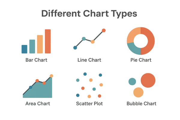
Choosing the Right Chart Type
It’s true that choosing the right chart type is the key step in making sure that you communicate accurate meaning. For comparison bar charts are a great option and line charts can clearly state trends over time.
Pie charts can be an issue, even though they are the most widely used chart type. Bad if it has too many slices or has too little variation. But if it has too many slices or little variation, that can be problematic.
The main point is to coordinate the appropriate chart to the data type, and the attributes of the information you want emphasized and communicated. Using bad types will confuse or lead the reader to misinterpretation, which will destroy trustworthiness and the validity of the information. Below, you can see different types of charts.
Simplifying Complexity Without Losing Meaning
Data can be extremely complex, but good visual design turns it into usable information by limiting complexity, but not eliminating meaning. Designers must make data less complex by synthesizing complex, multi-layered data into approachable, usable visuals that uncover important patterns, anomalies, or comparisons.
In synthesizing datasets into useful visuals, designers eliminate, whenever possible, visual distractions like gridlines, additional labels, or even overlapping legends, while maintaining the original value of the insights.
White space, consistent alignment, and simple design can also support clearer meaning making. To clarify, the goal is not to reduce complex data; rather, the goal is to make it usable and more approachable for users with varying levels of experience.
The Psychology of Visual Perception
Knowing how the human brain views visuals gives data design more punch. People process images more quickly than prose, using principles of proximity, similarity, and hierarchy.
The principles of Gestalt illustrate the brain’s grouping of elements and assists designers in logically organizing data. Cognitive load also comes into play, with too much detail causing viewers to switch off or become confused.
Using visual cues such as alignment, symmetry, and a focal point places their attention where you want it. Motion or an animation can reveal change over time, but use it sparingly, as it can distract.
Conclusion
Visual design is central to making raw data accessible, concise, and meaningful. Whether it be designs in colors, charts, or layout options, good visual designs can bridge the gap between complex statistics and effective communication.
Visual designs are able to clarify and even influence understanding, and shape insights into being acted on. For example, by integrating design principles and psychological understanding, we can convert static data into interactive visual stories that hopefully inform, persuade, and inspire.
Frequently Asked Questions
Why is it important to choose the right chart?
What is the role of color in data visualization?
Color helps group information, establish focus, and communicate feeling, all of which improve clarity of data visualizations (especially for trends, anomalies, or comparisons).
What makes data design psychologically effective?
Using visual principles such as figure-ground, hierarchy, and proximity helps the mind process data more quickly, and allows for better understanding and retention.

Related Posts

8 Best AI Presentation Makers for Business-Ready Slides
Making a presentation doesn’t just mean designing slides. It’s about defining a clear structure, using defined logic, useful visuals, and…

Retail Queue Management Software: The 7 Best Platforms for 2026
Businesses with poor queue management see return customer rates of 62%, while those with excellent queue management see rates of…

How to Use Similarweb Website Traffic Data for Competitor Research
Competitor research without traffic data is guesswork. You can guess who your rivals are, guess how big they are, guess…

Choosing the Right Hosting Model for Scalable Digital Platforms
The performance of digital business is directly related to website speed, uptime, and scalability. Slow page performance has a negative…

How Data-Driven Performance Tools Are Transforming Employee Recognition in Tech Companies
“People work for money but go the extra mile for recognition, praise, and rewards.” — Dale Carnegie (Writer & Teacher)…

Why Businesses Struggle to Collect Reliable Data from the Web
Almost every company that depends on data runs into the same problem: although they can find the data they need,…

Why Financial Data Recovery Matters for Businesses
Financial data supports every part of a business, directly affecting cash flow, payroll, tax reports, audits, customer billing, and daily…

CMMC Compliance Is Coming for Manufacturers. Here Is What You Need to Do
“Cybersecurity is much more than a matter of IT.” — Stephane Nappo (Cybersecurity Professional) For manufacturers working within the defense…

How Data-Based Tools Influence Learning Performance
Learning has transformed in the modern age with the integration of new technologies to help students and professionals prosper in…