User journey analytics means understanding how people actually use a website or app, step by step. It helps see where the user got confused, where they leave, and what makes them stay. All this is useful for improving the experience based on real behavior and not guesses.
Website Building with AI: Leveraging AI and Data Technologies for Enhanced UX
Updated on: Dec 10, 2025
Table of Contents
- What a User Journey Means in Data-Driven Digital Environments
- The Role of Data Insights in User Journey Creation
- Best Customer Journey Mapping Tools of 2026 (Cover any 5)
- Data Privacy and Security Considerations in User Journey Mapping
- Challenges and Limitations of Data-Driven User Journey Design
- Wrapping Up
- Frequently Asked Questions
User Journey: Something that businesses earlier thought of as a straight-line funnel, where the customer would just visit the website, sign up, and then buy whatever they like. And, this is actually the gist of it, but definitely not all. Because today, businesses have shifted to a proactive approach where they do not just wait for their potential client to browse through their store but present them with something they might be looking for, saving their time and effort.
But how? Well, this is where user journey analytics steps in. Organizations now track user behavior and understand their path with data to give the best services possible. This shift is especially visible in areas like SEO & AI consulting, where understanding how users search, interact, and convert is important for building smarter, more adaptive digital strategies.
As a result,around 67% of organizations say that it has a positive impact on customer loyalty, and many teams use journey insights to improve customer experience.
Ready to deep dive into this topic and learn how exactly data helps enhance the user journey? Stay tuned till the end as we unfold each and every step behind it.
Key Takeaways
- User journeys are not straight lines; they are real-life paths with twists and pauses.
- Data shows what users do, not what they say they do.
- Small insights can lead to big experience improvements.
- Personalization works best when it’s behavior-based, not assumption-based.
What a User Journey Means in Data-Driven Digital Environments
Traditionally, journey mapping meant relying on interviews and static personas. Cut to today, a bigger shift led by data analytics is noticed. In the digital environments, the user journey represents the observable path a user takes across platforms, devices, and any interactions made by them, supported by quantifiable behavioral signals.
Some important things that are noted in the data-driven user journey include
- Entry Points: Where did the client come from? Is it from an ad, a voluntary search, or referrals?
- Visitor Behavior: Their scroll depth, feature usage, and drop-offs.
- Contextual Factors: What device do they use, where do they live, their session duration, and timing.
- Conversion & Post Conversion Behavior: Do they come back or advocate for the store?
All these things allow businesses to actually understand what they may or may not be doing right, enabling them to take their services and customer support to another level.
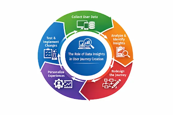
The Role of Data Insights in User Journey Creation
In the user journey, where does the data actually fit in, or where does it help? The math here is simple. By combining data and feedback, teams can identify patterns, friction points, and opportunities across the user lifecycle.
For example, let’s take a company that runs an online learning app where users need to sign up for courses. They manage their operations with the help of data in the following steps:
Step 1: Collecting data from user behavior: The website tracks data from pages user visits, products viewed, time spent on each page, and products added to cart.
Step 2: Turning data into insights: The collected figures are converted into useful insights, such as 75% of users viewed a specific product, and 25% of them added it to their carts. This reveals friction points in their journey.
Step 3: Redesigning the user journey with insights: The company reshapes the journey by eliminating friction points that might push the traffic away.
Step 4: Personalizing the journey with data: By using behavior-based triggers, systems personalize the journey for users.
Step 5: Measuring impact and evolving the journey: Observing the changes that followed this process and evolving as new data comes in.
The infographic below summarizes the whole process in a simple way, have a look!
Best Customer Journey Mapping Tools of 2026 (Cover any 5)
Among the various modern tools, the 5 given below prove to be the most effective ones offering event tracking, visualization, and advanced analysis to support data-driven decision-making:
1. Google Analytics 4 (GA4):
GA4 mainly focuses on event-based tracking that allows teams to collect and analyze cross-device/platform user journeys. Giving them a comprehensive view of the client’s journey.
2. Amplitude:
Amplitude is an excellent option for product analytics and behavioral journey analysis. It provides an easy-to-understand analysis, funnel optimization, and identifies features that drive long-term retention.
3. Mixpanel:
Offers real-time insights into user behaviour wth strong segmentation and flow analytics capabilities. Well known for tracking feature adoption and user engagement across SaaS products.
4. Adobe Analytics:
A popular option that offers enterprise-grade journey analytics with deep customization, integrating data from multiple sources and enabling advanced attribution and cross-channel analysis.
5. Hotjar
Another excellent choice that complements quantitative analytics with qualitative insights such as heatmaps, session recordings, and user feedback. Particularly useful for identifying usability issues within specific journey stages.
In 2026, businesses can rely on these tools to elevate their user journey using data analytics.
Data Privacy and Security Considerations in User Journey Mapping
In this modern approach to user journey, data privacy needs to be prioritized. Here are a few security considerations that must be kept in mind when shifting to this framework:
Consent Management and Data Minimization
The users must be taken consent from and informed on how their data is being used by the organization. And, with data minimization, they can reduce risk while maintaining analytical value. Some best practices for it are:
- Explicit opt-in mechanisms for tracking.
- Granular consent option for different data categories.
- Collecting only the data necessary to achieve specific analytical goals.
Anonymization and Pseudonymization Techniques
Anonymization and pseudonymization are two techniques used for protecting user identities. Anonymization refers to removing personal identifiers permanently; on the other hand, in pseudonymization, identifiers are replaced with encrypted or tokenized values.
Secure Storage and Access Controls
Data should be stored securely; on top of that, its access should also be controlled strictly, forbidding it from falling into the wrong hands. For this, companies should encrypt data storage and transmission, provide role-based access controls for analytics platforms, and perform regular audits and monitoring for unauthorized access.
With these measures, the data stored will be protected at all times, ensuring data insights do not come at the cost of user trust.
FUN FACT
Most users don’t read websites; they just scan them. According to studies, people only read about 20-28% of the text on a page.
Challenges and Limitations of Data-Driven User Journey Design
Yes, a data-driven user journey provides many advantages, but on the flip side, it also comes with a few challenges and limitations, such as
- Data fragmentation: User journey often exists across disconnected tools an platforms
- Over-reliance on quantitative data: Just focusing on numbers makes businesses ignore the emotional and contextual factors that ight be influencing behavior.
- Attribution complexity: Accurately assigning value to touchpoints remains difficult in multi–channel journeys.
- Analysis paralysis: Excessive data without clear objectives can slow the decision-making process. ‘
To address these challenges, businesses must follow a balanced framework that combines analytics, qualitative research, and strategic clarity.
Wrapping Up
User journey analytics significantly help organizations move past the static assumption and design the experience around real user behavior. It gives them a broader view of what may or may not be working in their favor, allowing them to make changes accordingly and offer the best to their customers.
Additionally, it also has a few ethical considerations and limitations that need to be addressed in order for it to work properly. By implementing the best practices mentioned above in the article, you can manage it all!
Frequently Asked Questions
What is user journey analytics?
How is user journey analytics different from regular analytics?
Traditional analytics tell you what happened (page views, clicks, conversions). And, user journey analytics covers how and why it happened.
Why are funnels no longer enough?
Funnels are no longer enough, as it assumes that users move in a straight line, which is not true. In reality, users jump between devices, take breaks, change their minds, and might come back days later.
Can user journey analytics really improve conversions?
Yes, they help businesses understand where users struggle or hesitate, enabling them to remove friction and make small changes that often lead to big results.

Related Posts
How Poor Contract Visibility Leads to Revenue Leakage in Growing Companies
Growth is an important factor that determines the success rate of any business. When we witness new operations, partnerships and…
Managing Bitcoin Operations? Here’s How Salesforce Automation Helps
“Digital currency is here to stay, and it’s only a matter of how long before governments embrace it.” — Brad…
Why Modern Organizations Depend on Data Privacy Software
Data growth has significantly accelerated beyond what most compliance teams can manage, with personal records, financial details, contracts, and emails…
Converting Chats Into Leads While Maintaining Professionalism
The way marketing teams and businesses approach their potential clients to boost their sales has completely transformed in the last…
How to Delete iCloud Account? Complete Guide for 2026
Thinking, how can I delete iCloud or Apple account? It is not just about removing an account; it is about…

How Different Industries Use Specialized Software to Stay Competitive
In the market we have today, companies are always trying to find ways to work better and get results. The…
What Key Adjustments Enhance Visual Appeal Across Web Pages
Attractive web pages form the roots of any appealing website. For instance, imagine looking for content on Google, and you…
When is it Time to Consider IT Support Services for Your Business?
Every business needs to ensure smooth operations for a successful business. But despite trying hard to avoid barriers, technical issues…

How to Delete User Profile in Windows 10: Step-by-Step Guide
You don’t notice user profiles until one starts causing problems. A profile gets corrupted, a login error pops up, or…