Did you know? Presentations with visuals are 43% more convincing than those without, according to SketchBubble.
Clear communication is fundamental in all IT projects, but a presentation also has visual components to help improve communication and engagement. Technical ideas often cannot be communicated properly if you solely rely on having text-based slides to get through your presentation.
For a complex technical concept or an involved technical workflow, all the requirements might be more easily explained using charts, diagrams, and dashboard interfaces to better navigate the complexity of a process.
Differentiate critical data, and bring everyone back together as a team. Visual storytelling improves understanding and provides opportunities for collaboration that make informed decision-making or project implementation smoother.
Using applicable visual tools can have a transformational effect on presentations and can support engaged dialogue and meaning-making for improved project and outcome collaboration.
That’s why in this blog post, we are going to explore everything about this segment and give numerous insights to the readers.
Let’s begin!
Key Takeaways
Understanding how to craft a clear project narrative
Exploring metrics to choose the right visual ads
Considering relevancy factors while selecting the ad campaigns
Discovering tools to simplify tasks
The end note
Crafting a Clear Project Narrative
Every IT presentation has a story that starts well. With poor structure, even the best information can become lost in misinterpretation. Start by figuring out the key goals of your project — what’s the message for your audience? Next, sketch out the main steps: the issue, the fix, and the outcome.
This way, even folks who aren’t tech-savvy can get what you’re all about. And remember, keeping it short is always a plus. Instead of overwhelming slides with technical data, use plain language. For example, instead of saying “asynchronous request processing implemented,” say “application performance improved.”
Interesting Facts 84.3% of presenters design visually focused presentations according to SketchBubble.
Choosing the Right Visual Aids
By using charts, diagrams, and mockups, the audience is able to fully comprehend the important points. In case you are presenting a web application, say, instead of a usual screenshot of the interface, you may use free mockups to display the appearance when it is presented on the screen of your laptop or smartphone. This adds professionalism to it and allows people to view the product in real time.
Mockups help you to show how the product works, be it as an app on a tablet computer or as a site on a monitor. A professional result can be obtained in a matter of minutes by the user using a smartphone, laptop, or even a smartwatch template, and pasting a snapshot of the project into it. This is more than handy for freelancers or small-sized crews who would want to make their graphics but lack the time.
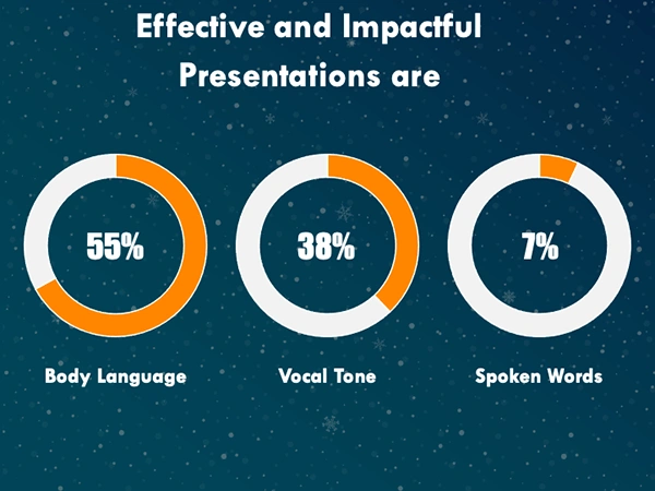
Intriguing Insights
This infographic shows key elements for an impactful presentation
Considering Relevance When Choosing Visual Aids
The relevance of visual aids should be kept in mind. A graph illustrating changes in performance after code optimization will prove to be more effective than a mystical diagram. We recommend the following be used:
Graphs and charts: To emphasize such measures as reduced response time or enhanced user activity.
Screenshots with context: Adding screenshots to mockups for a realistic look at the interface.
Icons and infographics: To highlight main features or stages of development.
After you add visual content, ensure it doesn’t clutter the slides. Keep it minimal.
Tools to Simplify Slide Creation
Preparing presentations is taking far too long. New tools make it easy while maintaining quality. We checked out a few platforms and picked the best ones for IT presentations.
PowerPoint: A classic that still rocks with its editable templates and fun animations. Toss in some mockups for that extra flair.
Canva: Perfect for those who need to whip up stylish slides fast, even without much design know-how. It’s got templates to help you out.
Figma: Most ideal for collaboration. Has real-time prototyping and interactive slide creation.
For instance, in Canva, one can simply upload free mockups and place them within a slide with just a few clicks. Figma is very efficient in creating interactive prototypes that one can demonstrate at the presentation time.
Tool
Key features
Best for
Free version
PowerPoint
Custom animations, offline access
Corporate settings
Limited
Canva
Drag-and-drop, template library
Quick designs
Yes
Figma
Collaboration, interactive prototypes
Team workflows
Yes
To be most efficient, maintain a consistent style (fonts, color), avoid minimal text, and test the readability on a projector.
Final Thoughts
Apply these tips to what you are going to do next. Beginning the process with a presentation plan, selecting the appropriate tool, and visually populating your statistics and accomplishments is the most effective approach. Your readers/listeners will be glad of your motivation, and you will be comfortable giving out your work.
Frequently Asked Questions
Is a visual presentation of statistical information?
Visual presentation of statistical data has become more popular and is often used by the researcher and the statistician in analysis. Visual presentation of data means presentation of Statistical data in the form of diagrams and graphs.
What is a visual representation in statistics?
As mentioned before, statistics and probability also involve visual representation through tables, charts, graphs, and diagrams
What are the tools used in data presentation?
Common tools include bar charts, line graphs, dashboards, pie charts, histograms, scatter plots, pictograms, textual presentations, and tables. Each tool has a unique way of representing data to aid understanding.